ROCKX
Creating a hi-fidelity interactive design for a hybrid music history museum, digital music archive and
event center dedicated to the history of Rock & Roll music but also to supporting its popular growth with new generations while showcasing emerging Rock & Roll artists.
MY ROLE
UX Designer
THE TEAM
Personal Project with guidance from professor and peers
TOOLS & METHODS
Axure RP 10, Figma, Communication with stakeholders


OVERVIEW
This project shows a Web B2C design for a hybrid music history museum, digital music archive and
event center dedicated to the history of Rock & Roll music but also to supporting its popular growth with new generations while showcasing emerging Rock & Roll artists.
RockX is a large facility with several attractions. It would take 2 full day visits to visit everything it has to offer. Most guests can only visit for a few hours or at most a single day. The chances of having a delightful visit experience are enhanced if the participant comes with a predefined plan based upon their interests and goals for their visit.
ROLE
Interaction Designer
DELIVERABLES
Hi-fidelity prototype
TOOLS
Axure
TIMELINE
6 weeks
Design Specifications
We were given a design brief and requirements from the company sponsoring the project and so no research was conducted on our part. We had the opportunity to communicate and questions with the sponsor to get clarifications and fully understand the scope of the project, use cases, and needs.

Persona 1: Rob (45 YO Family man)

Persona 2: Keith (65 YO Solo Explorer)
Rob is 45 years old and loves all different types of music. He wants to share this passion for music with his children (ages 5 and 11) and discovers ROCK X while they are on a family vacation.
He sees this as a perfect opportunity to teach about music and keep his kids entertained however he would like recommendations for the most informative and engaging tour plans since they have limited time.
Keith is in his 60’s and loves rock and roll music. He wants to go to RockX to relive the music of his youth and validate his personal experience.
There is so much he wants to see that he won’t be able to do it in one day, so he plans on making multiple trips to RockX since he lives locally, each with a different customized tour plan.
As an older adult, Keith worries about his ability to use the AR navigation feature of the RockX app.
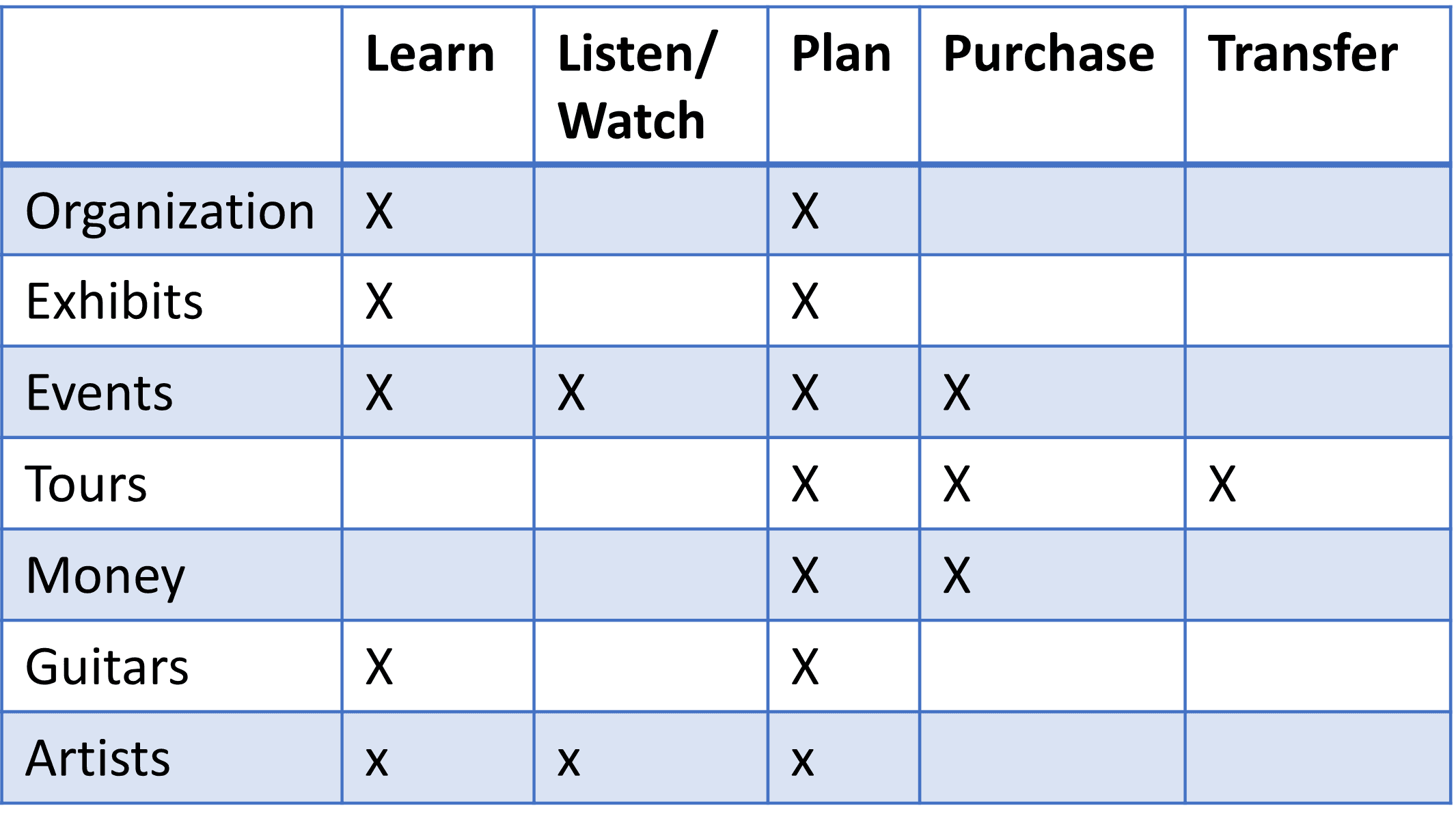
Action Object Matrix
This method involves listing out the main actions (verbs) and objects (nouns) that a user would need to interact with to achieve their goals and ensuring that all the user needs and requirements are met. Creating a dense Action-Object Matrix helps reduce the complexity and the cognitive load that a user would need to exert in order to navigate through the website with ease.
Prioritization Matrices
Creating a Prioritization Matrix helps decide which aspects and use cases of the design needs to be made most accessible to the users. It's important to remember that the levels of prioritization isn't solely decided based on the users' needs, but rather a common ground between accomplishing user's overarching goals and fulfilling business objectives.
The most common goals that users need to accomplish should be the easiest to discover and complete. Thus actions and objects directly related to these goals need to be the most visible and require fewer clicks.

User Flow
User Flows are incredibly important to design as users getting lost in navigation is a bigger usability issue compared to when they have difficulty interpreting an individual screen.
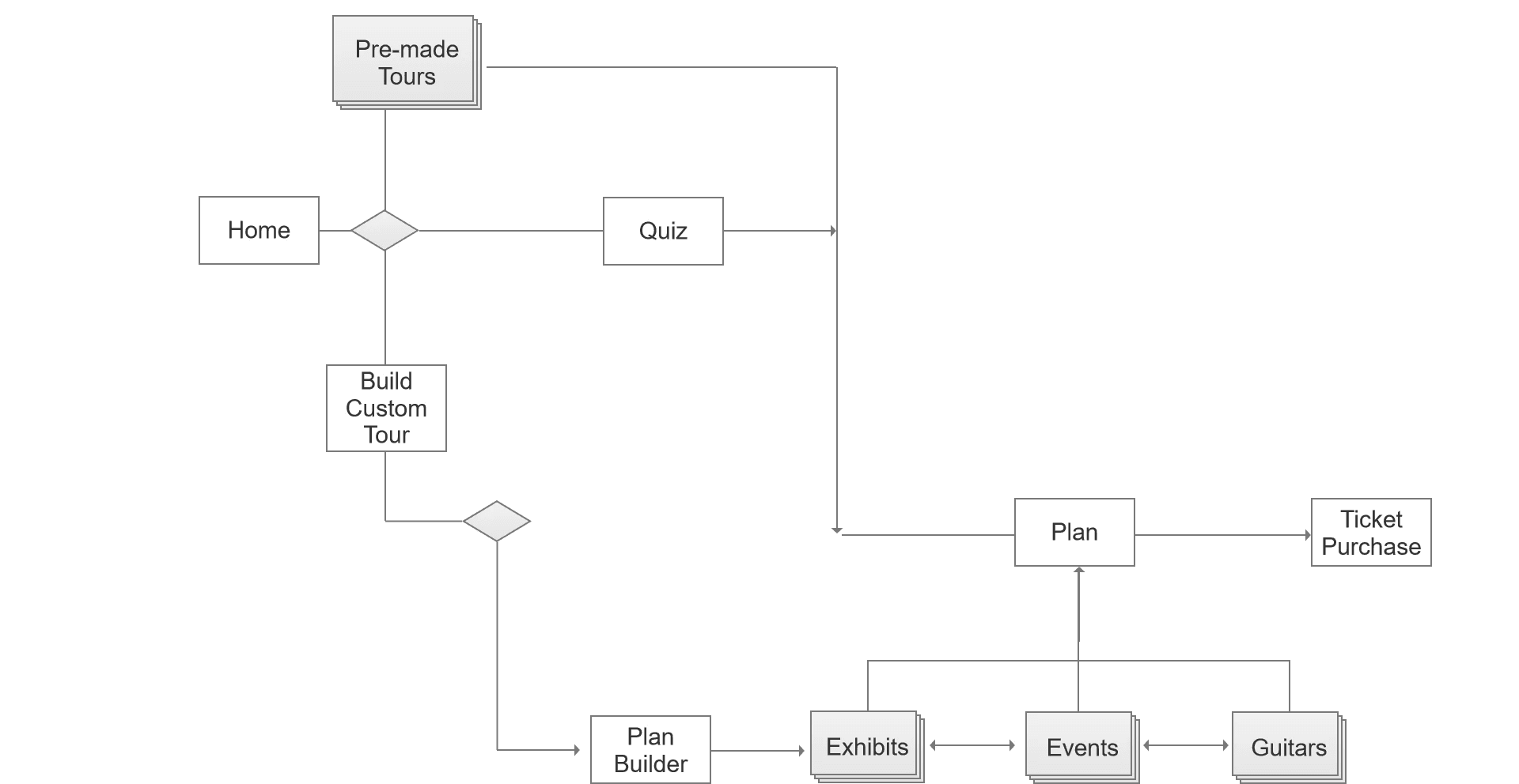
This user flow demonstrates the multiple methods a user could take to create a tour plan and purchase a ticket.
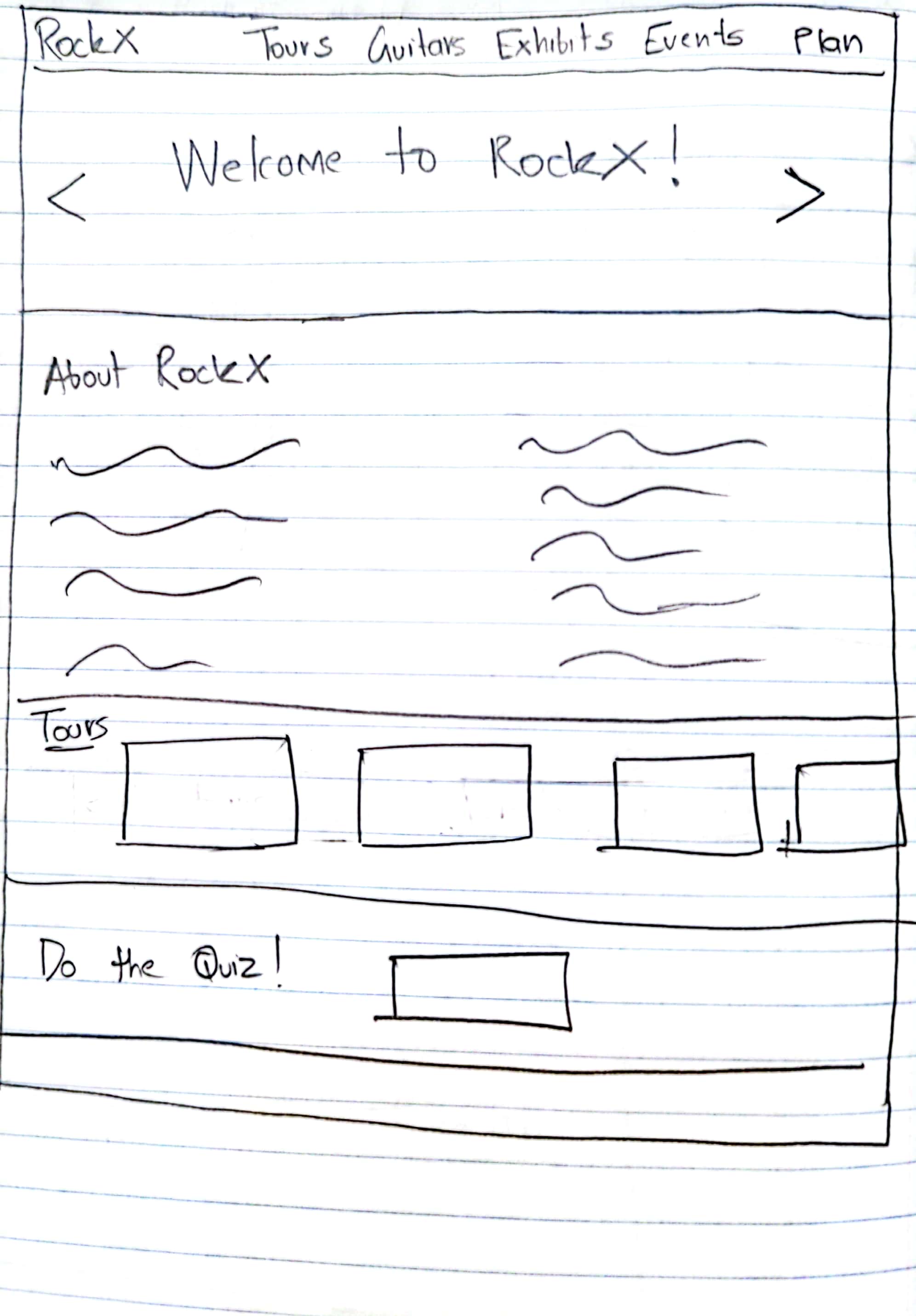
Sketches
I came up with three different types of sketches which allowed me to test out different ways to implement my grammar. The images above show an action-oriented design, object-oriented, and a hybrid (action + object combined). This iterative process allows me to plan out the general layout of the app while also ensuring that users would be able to navigate through the interface with ease.


This user flow demonstrates the multiple methods a user could take to create a tour plan and purchase a ticket.
Color Scheme
I chose this color scheme in an attempt to reflect a and bold colors to match the vibrant and exciting energy of Rock 'N' Roll while simultaneously being welcoming and friendly. These colors were also intentionally selected to have high levels of contrast to allow for easier readability.
I chose white as a neutral background color and created contours and depth using shadows to create a clean and polished look while simultaneously leveraging white space and Gestalt principles such as similarity and and proximity to further amplify this effect.

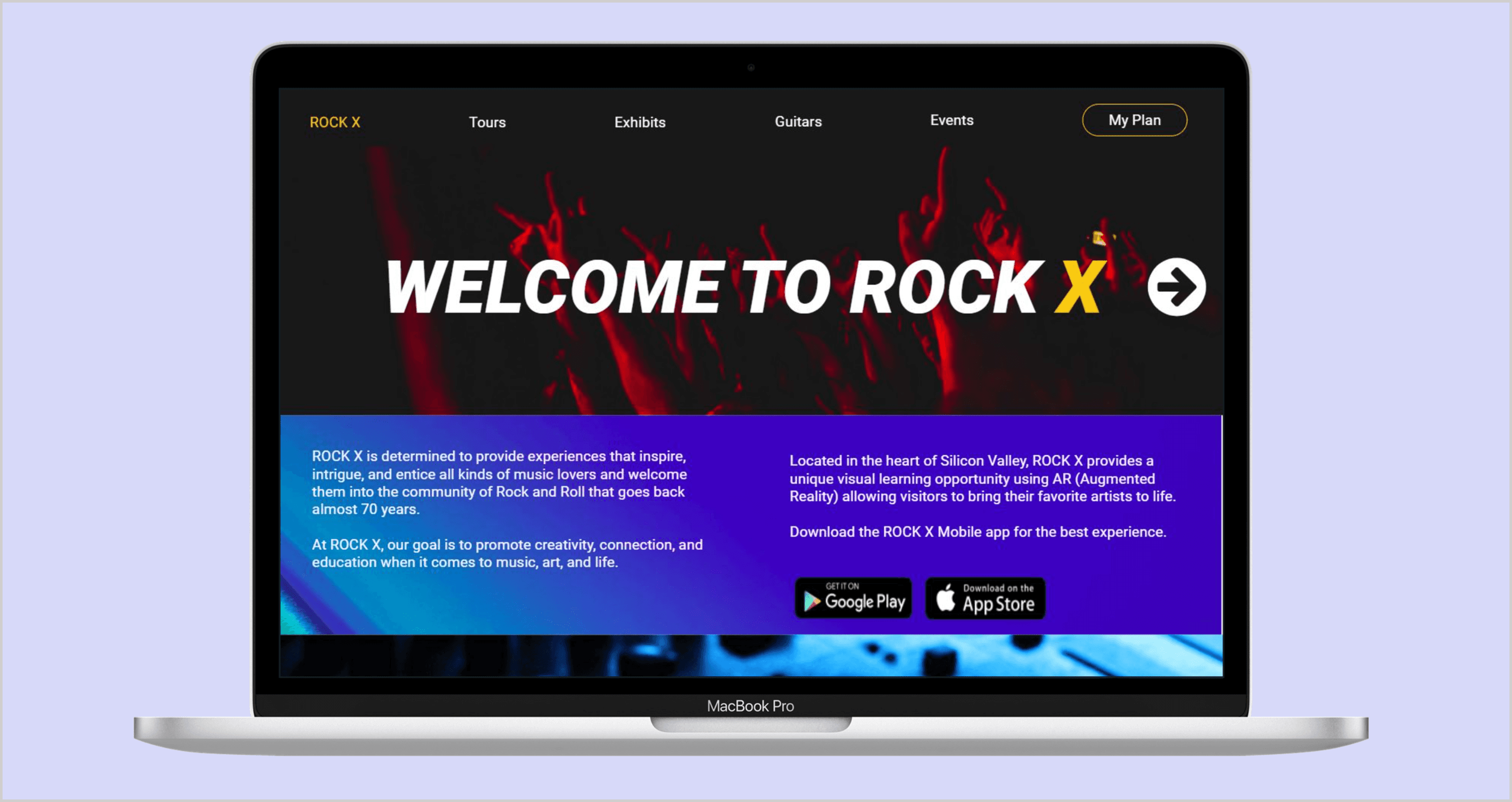
Homepage

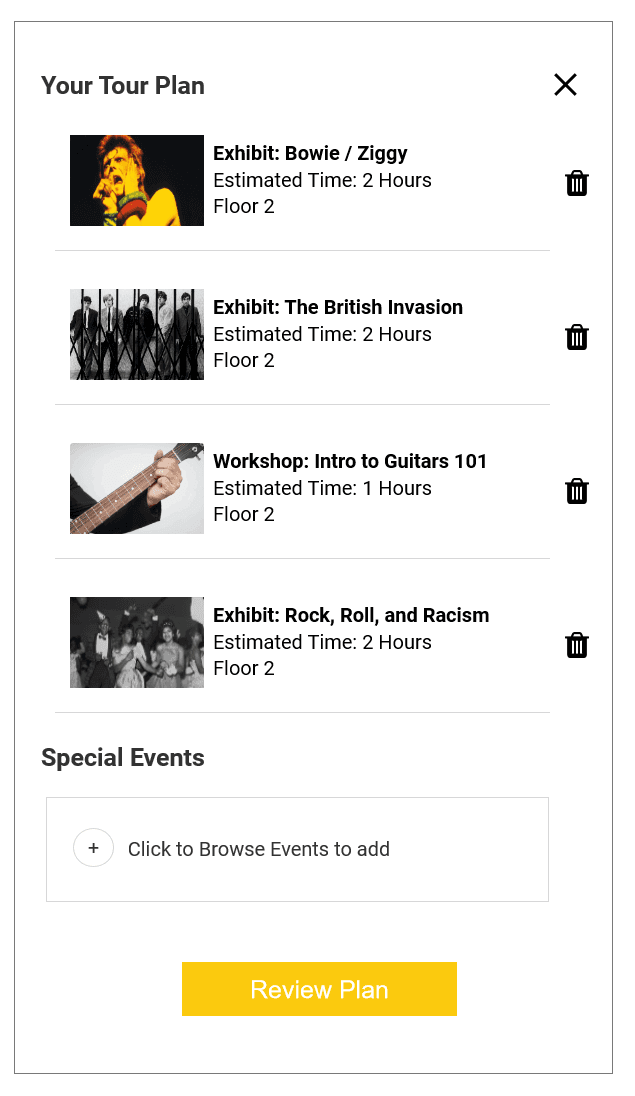
Adding Items to My Plan
The Operations manager can reassign loans to a different employee based on several factors including average cycle time, the employees current workload, the number of total milestones completed.
The system also offers recommendations at the top based on performance and area of expertise.

The system also displays the potential effect of re-assigning a loan on productivity by predicting the difference in the overall time to close caused by changing the employee working on a loan.
Detailed Tour and Exhibit Screens

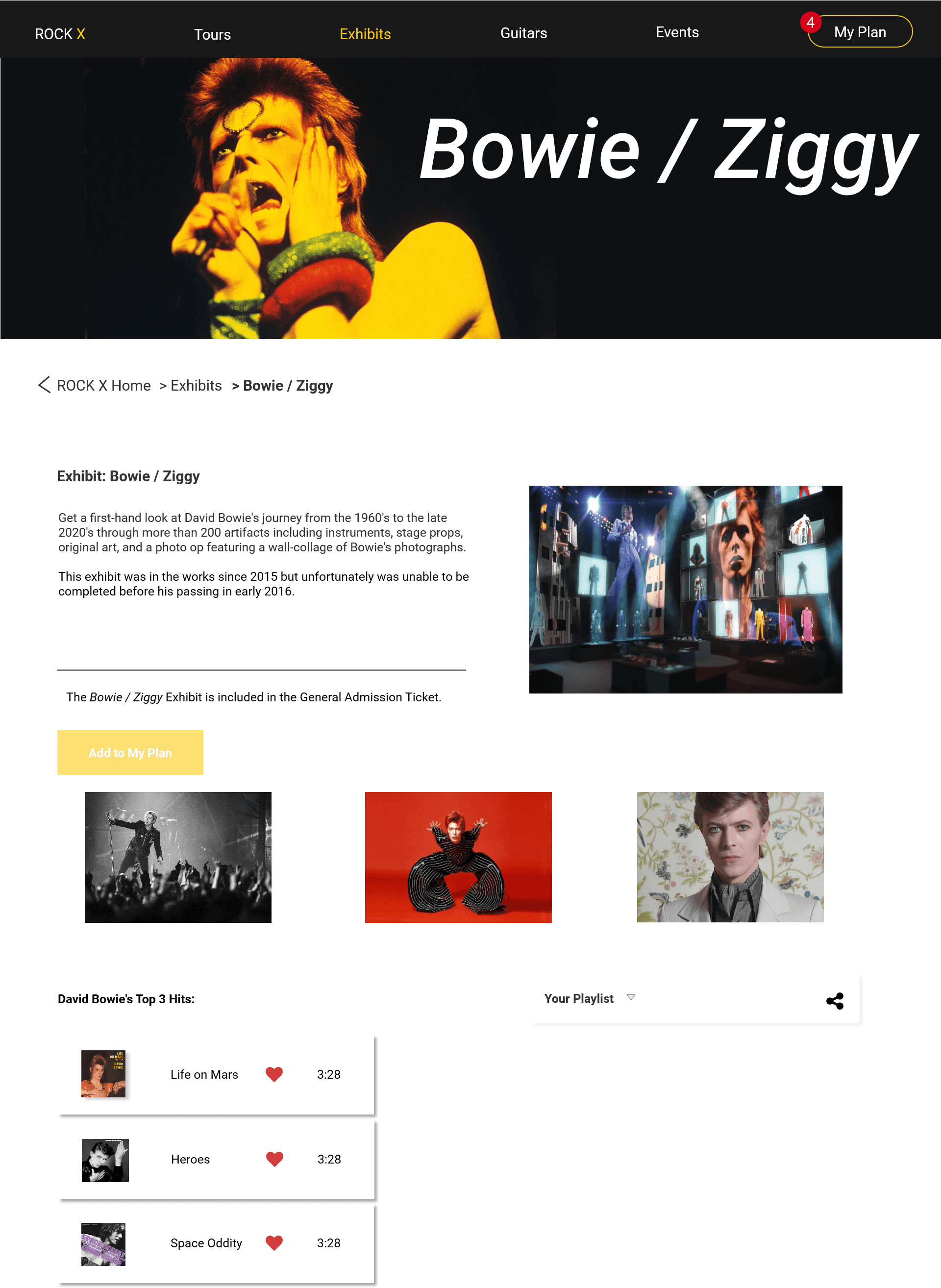
Users are also able to see detailed screens of events and exhibits with a breakdown of what items a Tour comprises of, more information about events, and brief histories about artists and guitars which are on display at the ROCK X Museum which users can visit.
Building a Custom Tour Plan
Users are able to create custom tour plans to help personalize their experiences. This feature is added in to cater to rock n' roll aficionados who may know exactly the exhibits and objects they want to see.

Events Page
The museum also sponsors and holds events using the space and so users will be able to add these to their tours as well (at an additional cost).

Quiz
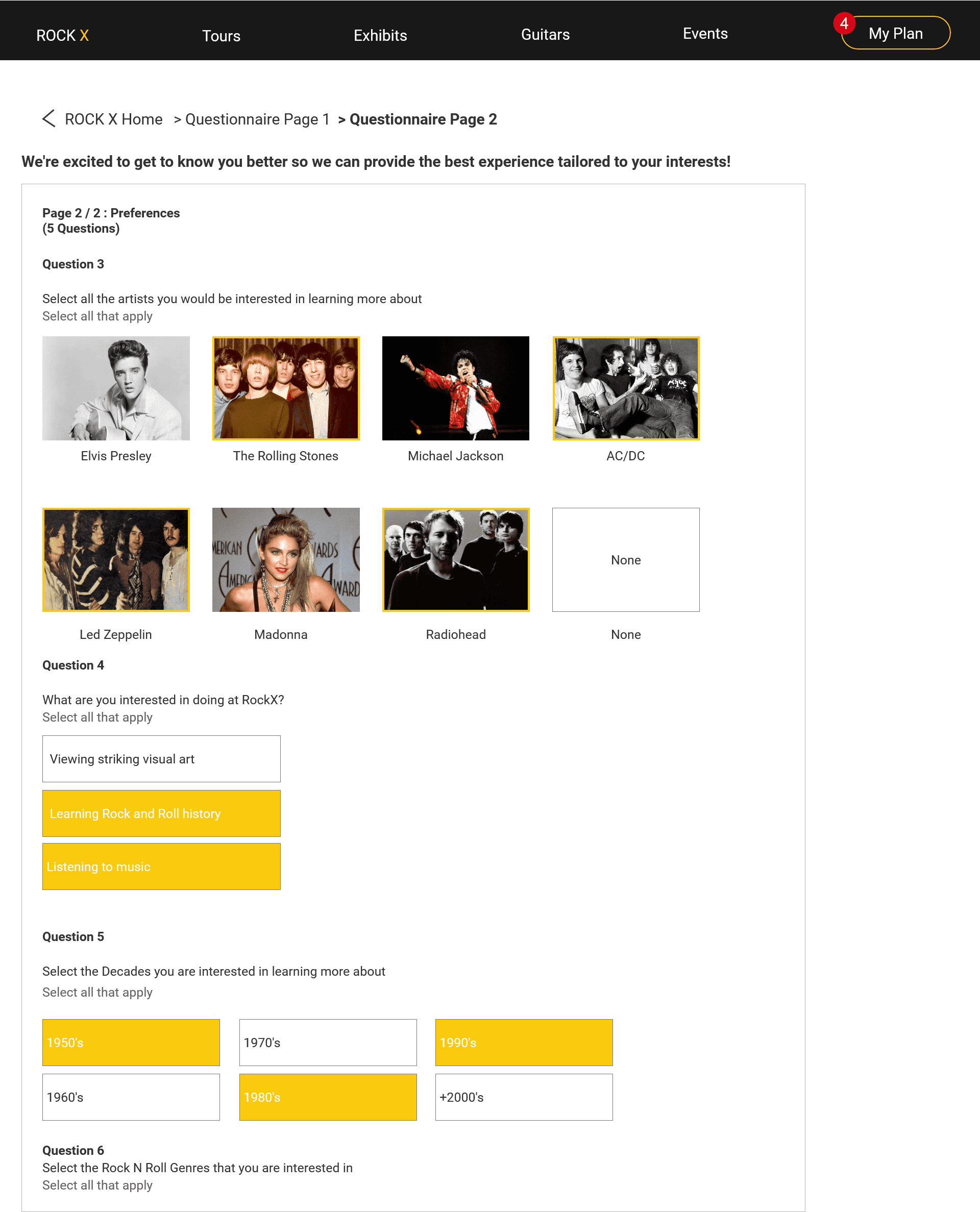

The design accounted for visitors being unfamiliar with Rock 'n' Roll and possibly being overwhelmed by the plethora of choices. So the design pushes users to taking a Quiz if they appear to be a first-time visitor as ROCK X aims to provide highly personalized experiences with tours that are tailored to the visitors' interests in the hopes of encouraging multiple visits.
Ticket Purchase

The main flow will eventually end once a user is able to purchase tickets for their tour which they've created (or selected).

Me presenting my work in a design review to receive feedback and critique from industry professionals and fellow peers.
I had the chance to receive and incorporate feedback into my work as I presented my design during two design reviews with my fellow peers and Design Industry professionals (namely Daniel Rosenberg, former Chief Design Officer at Oracle and SAP).
What I'd do Differently
Put more time into properly defining the gridlines during the sketching phase to ensure consistency across pages and so I can save more time during the high-fidelity prototyping phase.
Plan out the screens in advance more as I found myself with missing screens in flows during the high-fidelity prototype generation.
Conduct a usability test and/or a heuristic evaluation to measure users' actual abilities to accomplish key goals.
More Projects

Female Rideshare Drivers
Pokémon GO Usability Study
RockX